You can open the Preferences dialog box using the  button in the upper right corner of the program window or using the File → Preferences... command. It contains several tabs with different parameters:
General
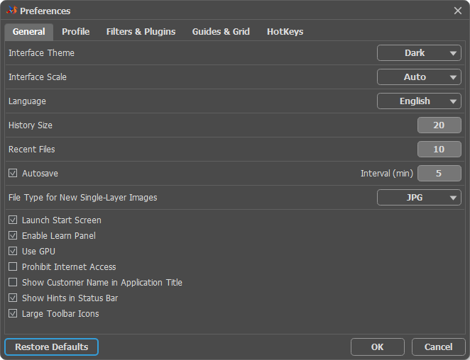
- Interface Theme. Select a style of the program interface: Dark, Light, or Gray.
- Interface Scale. Choose the size of the interface elements. When it is set to Auto, the program workspace will automatically scale to fit the screen resolution.
- Language. Select an interface language from the drop-down list.
- History Size (0-100). This parameter defines the number of document states displaying in the History panel. If the value is set to 0, the panel contains an unlimited number of states.
- Recent Files (5-30). The number of recent documents. The option allows recently closed files to be quickly re-opened.
- Autosave. If the check-box is enabled, a recovery file is automatically generated at the specified time interval. It helps you retrieve unsaved files after an accidental closure or crash.
- Default Format to Save New Single-Layer Images. Set a default extension for saving new single-layer files (JPG, PNG, TIFF, or AKVIS). You can change the file type in the Save As dialog box.
-
Launch Start Screen. If the check-box is enabled, the Image Window provides quick access to creating a new file and opening previously used files. To pin a document in the list of recently opened files, click the button
 next to it. To unpin the document, press the button
  .
.
- Enable Learn Panel. If the check-box is enabled, the panel with links to tutorials appears at the bottom of the Start Screen.
- Use GPU. The check-box lets you turn on GPU acceleration.
- Prohibit Internet Access. Enable the check-box to block the program from connecting to the Internet. In this case, some features will become unavailable: the latest news, a feed with video lessons, and the program activation through a direct connection to the server.
- Show Customer Name in Application Title. If the check-box is enabled, the license owner's name is shown in the program title. It's the name that was used when activating AliveColors.
- Show Hints in Status Bar. When the check-box is enabled, a hint for the selected option is displayed at the bottom of the program window. It's a text line with a brief description of the panels, filters, tools, parameters when the mouse cursor is hovering over them.
- Large Toolbar Icons. When the check-box is active, the tool icons become larger.
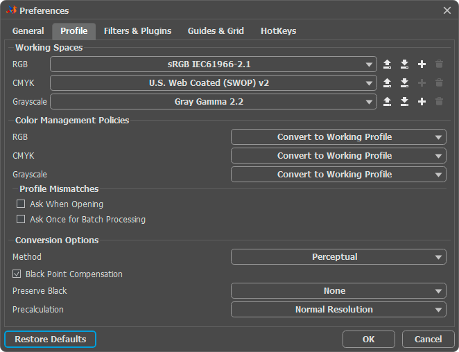
Profile. Color profiles are necessary to accurately and reliably transfer color to different output devices (screens, printers, etc.). They help to standardize the appearance of images. Learn more about color profile settings here.
Filters & Plugins
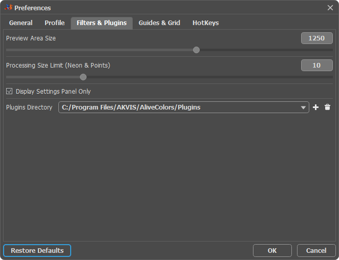
- Preview Area Size (in pixels). The parameter sets the size of the preview window used in effects and adjustments. The size of the area can vary from 200x200 px to 2,000x2,000 px. You can manage the displaying of the preview window by enabling/disabling the Fixed Preview Area check-box in the parameter panel.
- Processing Size Limit (Neon & Points) (in megapixels). The parameter works only for the built-in Neon and Points plugins. It allows you to speed up the calculation by temporarily reducing the size of the file being processed. When the file size (in megapixels) does not exceed the specified number, the image is processed in the usual way. If the size of the uploaded file is larger, then during the process the image will be reduced, processed and increased to its original size.
- Display Settings Panel Only check-box. Enable the check-box to display only the Settings Panel when launching the effects and filters. All other panels attached to it will be hidden (except for Toolbar, Navigator, and Hints).
- Disable External Plugins check-box. When this check-box is enabled, the program will not be able to access external plugins.
-
Plugins Directory. Specify the path to external plugins compatible with the AliveColors image editor. To add a new path, click the button
 and select a directory. Press on
  to remove a path.
Guides & Grid
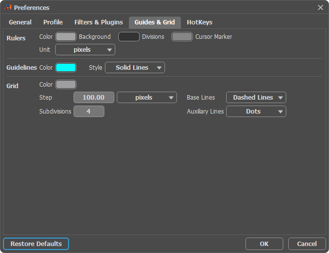
You can show/hide the guideline elements using the Workspace menu. The parameters are divided into three groups:
-
In the Rulers section, you can adjust the color of the ruler lines:
You can change the Color of each element by clicking the corresponding color plate: Background, Divisions, Cursor Marker.
Select a Unit of measurement in the drop-down list or by clicking a ruler with the right mouse button.
-
In the Guidelines section, you can change the appearance of guidelines:
Select a Color of guidelines by clicking on the color plate.
In the Style drop-down list, specify the type of lines: Solid Lines, Dashed Lines, or Dots.
-
Using the Grid section, you can change the appearance of the grid, which consists of base lines and auxiliary lines.
Color of the grid lines can be changed by clicking on the color plate.
Step adjusts the grid spacing between the major lines. You can change units for this option.
Subdivisions - this option defines the spacing between auxiliary lines.
You can adjust a view mode for the grid lines (Lines, Dashed Lines, Dots).
There are two drop-down lists for each type of lines: Base Lines and Auxiliary Lines. -
In the Mask section, you can change the color and transparency of the fill in the mask channels, selection, and alpha channel:
Color. To change the fill color, click the plate and select a color from the color dialog. The default is red.
Opacity (0-100%) sets the fill's translucency.
HotKeys. Using this tab, you can customize the keyboard shortcuts.
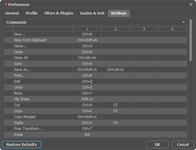
To save changes made in the Preferences, press OK. If necessary, click Restore Defaults to reset to the default settings.
